
April 2023 - August 2023
(CareerFoundry UI Specialization Course)
Timeline
Tools


A responsive web app that provides property buyers with information on properties of interest.
Objective
Real estate is an increasingly popular way for people to achieve financial security. Within the past few years we have seen real estate boom into a lucrative investment opportunity. Real estate is an exciting and emotional experience, however it is also complicated. While there is plenty of information out there about real estate investment, often new buyers still struggle to get started without professional guidance and waste time viewing properties out of their range. Perfect Properties seeks to provide them the expertise needed to get started efficiently.
Introduction
UI Designer
As the UI designer, I was responsible for all visual deliverables including, but not limited to: wireframes, mockups, logos and the style guide. With the user research provided to me I was responsible for creating a design that provided an empathetic solution for our primary user. My central goal, was to make the process of real estate investment as simple and frictionless as possible for our end user through conscious design choices.
My Role
User Persona

User Flow

In a relatively mature market, I sought to differentiate Perfect Properties by catering to the very new real estate investors. Real estate has an incredible amount of data involved with multiple competitors including massive amounts of information on a single property. The real estate process in its entirety is often a slog, like wading through mud and our web app shouldn’t add onto that mound. Some very intentional things I thought about were an efficient interface that was clean, simple and straight forward with limited clicking, so the user would be able to obtain the right information as fast as possible.
Ideas Loading…
I began the design process by brainstorming and then creating low fidelity wireframes based off the user flows that were created.
Low Fidelity Wireframes

Once I form the skeleton of our screens I begin to bring them to life by digitizing them. UI elements and components are all added to create mid-fidelity wireframes. A general idea of our design constructs begin to formulate, so things such as spacing and hierarchy really start to define themselves at this stage.
Mid Fidelity Wireframes

At this point, I’m not entirely set on the UI aesthetically. Some aesthetic choices still concern me, the circular image on the landing page might be hard to accommodate as far as imagery is concerned. I thought about a step by step process for the preferences page, but decided to keep a simpler, straightforward approach and kept them all in one interaction. The tabs on the property listings with the dollar amount concern me at this point, as they block out a portion of the property image, which may affect visual clarity.
Synopsis So Far…
WIth the primary screens in tact, I curate a mood board to begin the branding process. I consider things such as what I want the branding to convey. Colors, imagery, icons and type are all selected to form the foundation of my design and branding. Ultimately, we wanted the branding to convey optimism and excitement. The greens convey financial growth and vitality with the splash of orange representing excitement. The property images are also curated in a way to show interest with sharp angles and form.
Mood Board

Using the mood board as a jumping point, I create a style guide defining all elements of our UI. This style guide will be the foundation of our UI and will allow for me to create a consistent and defined visual style that is representative of the brand.
Style Guide

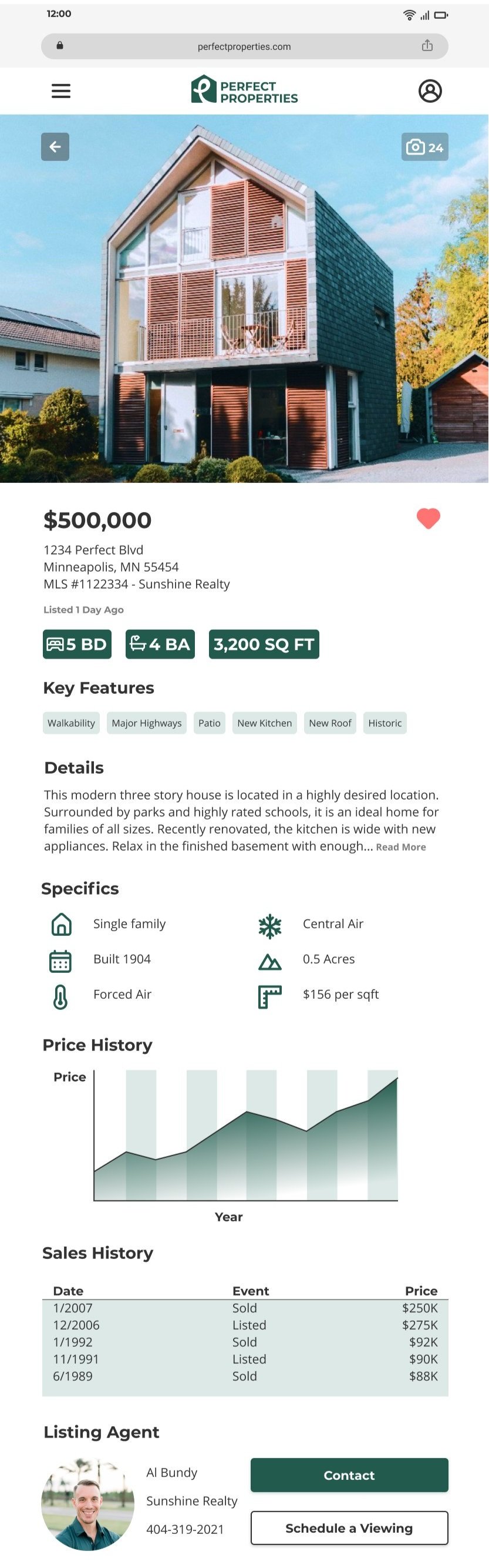
Ok, so from the looks of it, everything went smoothly and came together seamlessly. Not true. The little tabs on the property listings? Yeah... we removed them. They were too distracting. The input fields were slightly changed as well, with the text identifiers being moved above the input box. The imagery was re-evaluated, and instead I opted for a more refined and subtle approach to decrease visual distraction. Tabs were also created on the property listings screens that provide quick details about the property, such as the amount of bedrooms and bathrooms and square footage. This allows for the faster absorption of important details. These changes just goes to show that the iterative process is always in motion.
Are We There Yet?


High Fidelity Wireframes

Mobile Wireframe
Tablet Wireframe

Desktop Wireframe
